The latest updates and improvements from The Student Room
It's going to be an exciting year for The Student Room and this page enables us to share with you the latest developments and releases to improve the user experience for both students and recruiters across our sites.
2024 on The Student Room
Jan - Dec 2024
What's new...
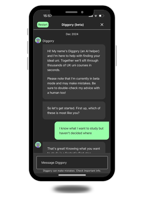
Introducing Diggory! The AI coach helping students choose the right university
Diggory is a new AI-powered coach in beta within The Student Room app that helps students make confident, informed choices about where and what to study. Moving beyond one-size-fits-all league tables, it focuses on what matters most to each student using trusted data from The Uni Guide and authentic insight from The Student Room community.
What Diggory Delivers...
Personalised guidance: Tailors course and university recommendations to each student’s goals, interests, and academic profile.
Data-driven decisions: Uses verified UCAS, HESA, Graduate Outcomes, NSS, and LEO data from The Uni Guide for accuracy and transparency.
Authentic student insight: Connects users with real peer experiences and discussions from The Student Room community.
Meaningful engagement for universities: Attracts high-intent applicants, increases registrations, and drives traffic to in-app Uni Guide course pages with lead buttons.
Marketing reach: Promoted to students, schools, and parents across The Student Room network, ensuring visibility where education choices are being made.
Diggory is live now in The Student Room mobile app on iOS and Android.
New in CAMPUS Lens™ - The AI-powered Sentiment Report
We’re excited to introduce the Sentiment Report, the latest addition to CAMPUS Lens™, The Student Room’s live reporting dashboard for university partners.
Using AI-powered analysis, the Sentiment Report reveals how students really feel about your university. It analyses millions of genuine peer-to-peer discussions across The Student Room to give you a real-time view of brand perception and how that compares across the sector.
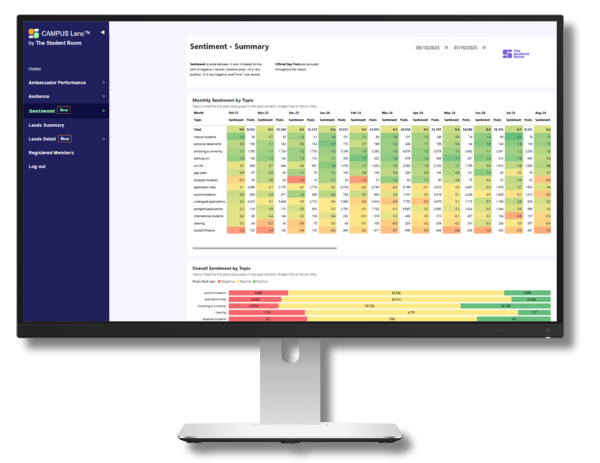
What the Sentiment Report delivers...
- Real-time insight into student sentiment and tone
- Benchmarking across the higher education sector
- Authentic data from genuine student conversations
- Sentiment scoring from –5 (negative) to +5 (positive)
- Actionable intelligence to inform marketing, recruitment and long-term
Understanding student sentiment gives universities a new way to track brand health, uncover opportunities and shape communications that resonate. It’s insight you can act on, helping you plan strategically and demonstrate the impact of your campaigns strategy.
If you’re a University Partner, the Sentiment Report is live now in CAMPUS Lens™
If you’re new to CAMPUS Lens™, find out how to unlock these insights for your university.
Our new University profile pages are now live!
Your redesigned uni profile page, combines the best features of The Student Room and The Uni Guide into one seamless experience.
The new profile pages make it easier than ever for you to maintain the information about your university and drive lead generation with clear CTAs.
The page is now live on The Uni Guide site and coming soon on the app!
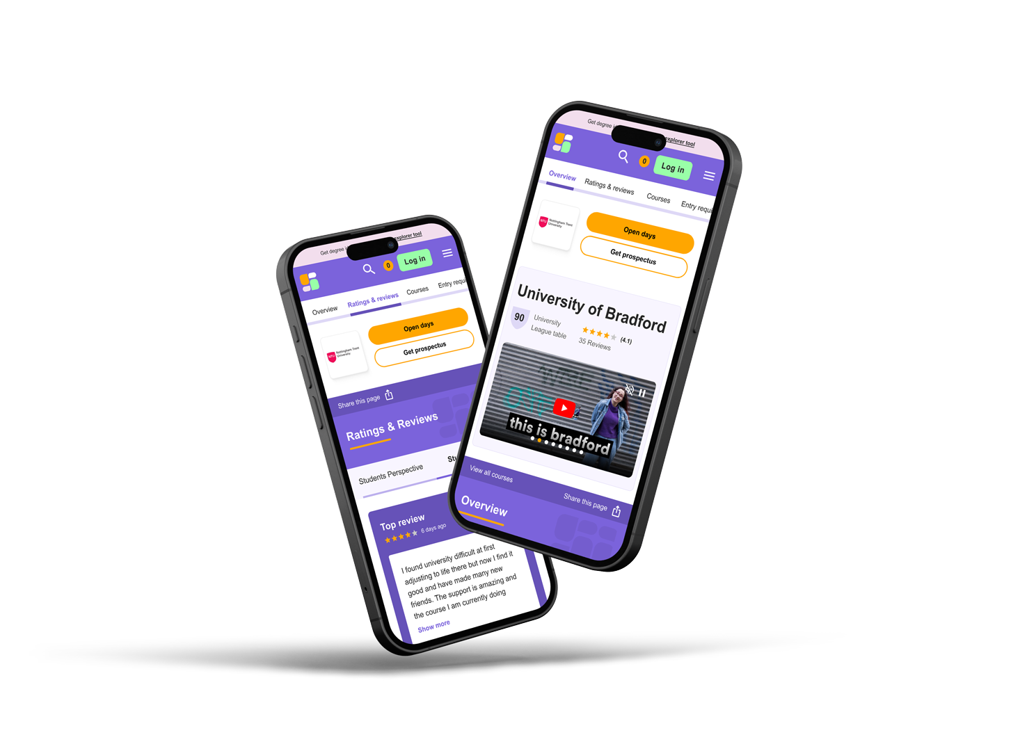
Why the change?
We've crafted these pages with students in mind, providing them with all the information they need about your university.
Powered by NSS, DLHE, and HESA data points, along with student reviews, our profiles also include easy links for students to join conversations about your university on The Student Room or contact your Official Rep with questions.
What's new...
- New Video & Image Carousel: Showcases your campus with a new video feature at the top of the page, alongside imagery. (Provide us with a new video if needed!)
- Top Student Review: Highlights and pins a top student review at the top of the review section. (You can change which student review to pin)
- Star Ratings: Makes it easier for students to see overall summaries for each review with our new star rating system.
- New Course Widget: Highlight courses available by UCAS points, allowing students to explore courses more easily.
- Guide Pages on Our App: Coming soon - students will be able to access all the rich information from our guide pages right from our app as well as the website.
- University Rankings: Added rankings from sources like Guardian University Guide, Complete University Guide, and The Good University Guide.
- Full Range of NSS Scores: Display the complete range of NSS scores (source: NSS).
- Graduates in Work and Further Study: Now split out data to show separately for UG and PG graduates (source: Graduate Outcomes).
- Tuition Fee Statements: Display ranges and/or typical fees for UK and international courses (source: UCAS UG course data).
- Encourage Student Reviews: Keep your reviews up to date by encouraging your students to leave their feedback.
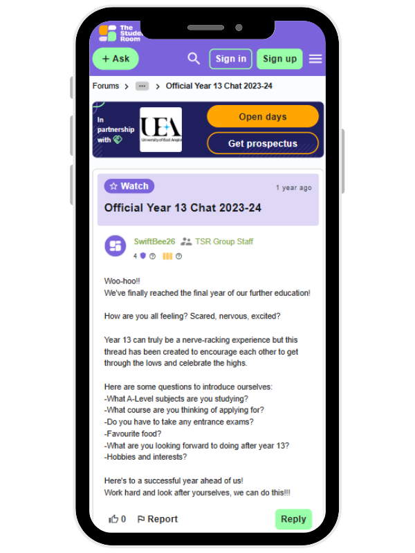
Discussion Partnerships
Discussion Partnerships offer an exciting new opportunity to build recognition and affinity through key conversations on The Student Room. Giving you exclusive partnership status for key university application discussions in your subjects or regions of focus, your brand awareness will be boosted, driving engagement all year long.
With an “In Partnership with…” space on both the site and app, this partnership delivers extensive brand visibility and long-term association with high-intent student discussions, helping your institution stand out in a competitive market.
Choose from the below options in your content block:
- Your active lead gen buttons (e.g. open days)
- Reviews from The Uni Guide and Did You Know facts
- Your own CTA with link
You will have ownership for 50 weeks of the year (excluding Results Week and following week)
Find out more about Discussion partnerships here