At The Student Room we send over 55 million emails a year, so we understand how much time and thought goes into crafting the perfect marketing email. If your open rates are low however, that effort can soon go to waste. A recent study by Litmus stated informative or optimised preview text can increase the open rate up to 45%.
We’re going to get our geek on and share some top tips to optimise preview text in emails, enhance what your recipients receive in their inbox and explore how it can make a difference to your all-important open rates.
WHAT IS PREVIEW TEXT?
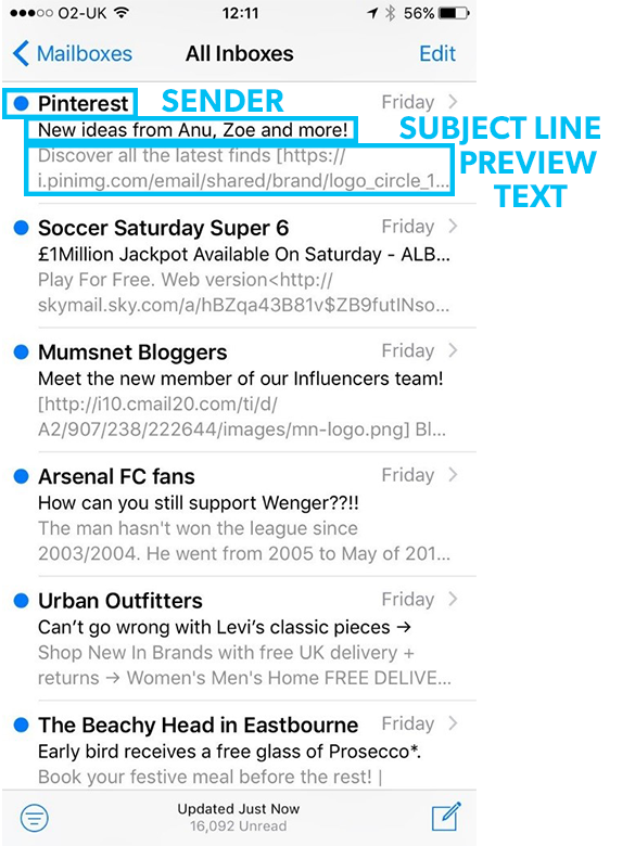
Also known as pre-header text or a second subject line; preview text is the text displayed under the ‘from’ name and subject line in your inbox.
It tends to be the first snippet of an email, but as marketers it’s another opportunity to encourage opens and provide more information about what’s featured when you click through.
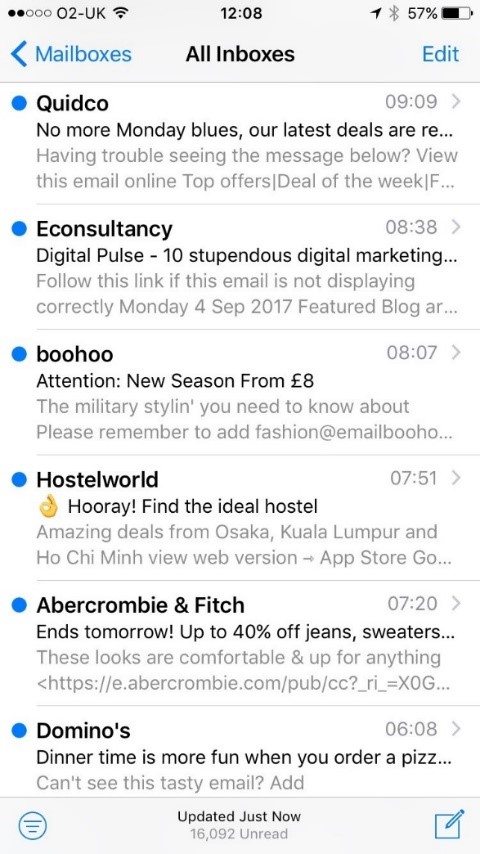
It’s an impactful feature in your email marketing tool kit that many marketers overlook, so it’s not surprising to see companies like Dominoes, Abercrombie & Fitch and Pinterest still not utilising this opportunity of an ‘extended subject line’. And if they’re not using it, it’s unlikely your competitors are too…
So, what happens if you don’t?
The first part of your email will display in its place, messages like “View email in browser” or “Email not rendering properly?” are typically used or we’ve seen even worse… Unsubscribe links!
While these are still important to include in your emails, it’s certainly a waste of space when it comes to your pre-header. It’s also an eye sore, especially when you’re looking at a long URL featuring meaningless numbers and letters:


TIPS TO MAXIMISE YOUR PRE-HEADER
24% of respondents look at the preview text before deciding to open an email, so how can you ensure you’re capturing that audience and making the most of this space?
The length of preview text varies; most email clients display an average of 75 characters but Apple Mail displays 140, so it all depends on your user’s device. On desktop, the pre-header text takes up more space than the subject line does (see image below), and on bigger mobiles (e.g. iPhone 8 Plus’ 5.5 inch Retina display) the pre-header text is given even more space, sometimes up to three lines.
So, check out what device the majority of your users interact with and select the relevant character length for them.

- Personalise: Save your limited subject line space and use personalisation in your preview text instead. This will improve interaction rates and ensure each recipient receives a completely unique experience.
- Use a call-to-action or compelling special offer in your preview text to make you stand out from the crowd in someone’s inbox. An attractive number will entice your users to click through and drive up your open rates.
- Tell them what they’re getting: Encourage the reader to open and scroll by revealing what else is featured in the email.
- Hiding your preview text: You might find your pre-header conflicts with your email body from time-to-time but don’t worry, you can hide the preview text avoiding any duplication’s. Simply make the size of your font smaller and change the colour so it’s the same as the background and therefore won’t appear in the body of your email. It’s a simple solution which saves you playing around with any source code.
Get one step ahead of your competitors and maximise on this extra space to persuade your users to click through and take action. It’s a simple trick that can make a big difference so don’t underestimate its power, let it become a part of your everyday email marketing and watch your open rates rise.
Want to find out more about how you can optimise your email marketing? Sign up for a Discovery Day at TSR headquarters.

