How to make your Clearing creative not suck
Assets from webinar held on 24 February 2021
Get insights from over a hundred 2019 and 2020 Clearing campaigns.
Watch the webinar recording:
How to make your Clearing campaign not suck
Presenter: Hulda Fridriksdottir
Client Services Manager
What we know about students and Clearing campaigns
We've collected data from over a hundred Clearing campaigns run between July and August (2019 and 2020).
During Clearing 2019 and 2020, The Student Room recorded:
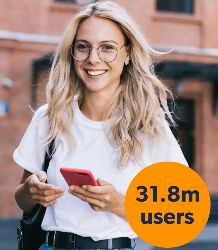
- +31.8m users onsite
- +35.9m sessions (average session time in 2020 of 2 minutes 39 seconds)
- +81.3m pageviews
Display campaign performance July - August 2019 and 2020:
- +116m impressions
- 86,507 clicks
- 0.35% highest CTR
Email campaign performance July - August 2019 and 2020:
- +9.6m email sends
- +3.6m email opens
- 107,677 clicks on campaign links
- 39% highest CTO
We strongly recommend doing brand work prior to launching your core Clearing campaign, to warm students up to your brand and your purpose.
Display campaigns: formats
Plan your creative to suit the ad space: Consider whether your creative is fit-for-purpose in the intended format. For example, you can use more text on a Leaderboard (LB) than a Mobile Leaderboard (MLB).
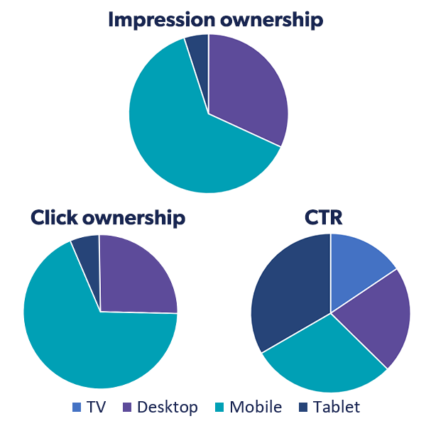
Choose the right ad size: Identify which formats and devices will perform best for your goals. Based on 2019/2020, these are:
- Best for impressions: mobile; MLB or Mid Page Unit (MPU)
- Best for clicks: mobile; MLB or MPU
- Best for CTR%: mobile, then tablet; MLB or Billboard (BB)
Think about how your ad will look on mobile first: This is highest for impressions and clicks. Although tablet was slightly higher for CTR.
Use animation-style gifs rather than static ads: They performed 30.3% better than static for CTR. They also significantly outperform static for impressions and clicks. In 2020, the best gifs used fluid animations (such as fading text) compared with 2019 which tended to use a series of separate frames. Keep the file size under 100kb and include your branding (logo) on all frames. For those using static, a new trend we saw in 2020 was that 66% of static ads had no CTA.
Sample data, represented based on the equation that the highest CTR that year =1
Display campaigns: layout, imagery, copy and CTAs
Layouts, images and fonts: Our top tip is do not over-clutter your creative. In terms of the creative arrangement, in 2018 and 2019 the most effective layout was: message/image, CTA, logo (left to right). In 2020, it flipped to: logo, message/image, CTA. Generally speaking, busy photography or imagery did not perform well in 2020. In terms of font, it's best to use sans serif - perhaps because this mirrors the style Gen Zs are used to seeing on social platforms.
Factor in student sentiment and wider contexts when writing copy: Effective messaging trends in the pandemic year of 2020 were significantly different from 2019:
- Length: In 2019, short and to-the-point copy worked best, but in 2020 the top-performing messaging was much longer and more conversational
- Tone: In 2019, the best messages were assertive and action-focused, but in 2020 it was more important to be supportive and considerate
- Focus: In 2019, the best creative focused on places and availability (the what), while 2020 messages emphasized purpose and belonging (the why)
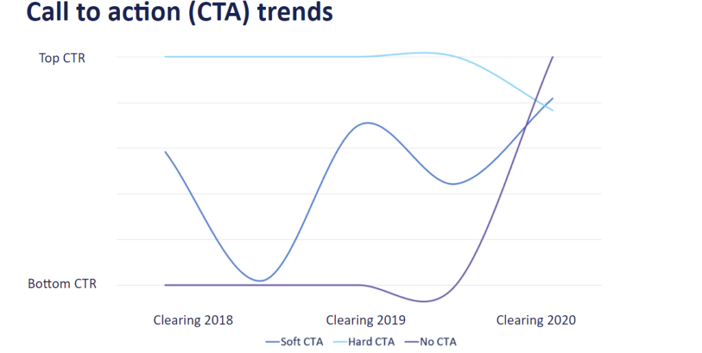
Be aware of the impact of external factors on your CTA effectiveness: In 2020, creatives with no CTA at all performed best, whereas in 2019 these performed worst. In 2019, hard CTAs (like 'Apply now') were dominating, but we saw a huge drop off in 2020. Soft CTAs (like 'find out more' or 'view courses') did much better in 2020 than the previous year, which is consistent with the shift away from urgency-led copy which we see reflected in messaging too.
Think about how your audience is feeling when choosing a colour palate: In 2019, red, pink and bright sunset colours were popular (in addition to some blue tones). Bright colours attract attention, but can also be abrasive and evoke emotions of fear (think warnings, urgency, take action). In 2020, the most popular colours were muted, cool tones like blues, greys and dull yellows. Blue is associated with serenity, calm, trust, seriousness, and sadness, so may have resonated better with students in lockdown.
Our Dos and Don'ts for killer display campaigns
Do
Work on your brand before Clearing
Include your logo in every frame (gifs)
Plan CTAs in advance: be mindful that external events impact how your CTAs resonate with students
Use head-on photographs: use photos sparingly, but if you are using them make sure faces are looking to camera
Incorporate messaging words in design
Test, test, test: split testing ensures you are using the most attention-grabbing creative
Don't
Use serif fonts or more than two fonts in one creative
Don't make creatives too image-heavy
Don't use block colour in lime, mint or apple green shades (accents of green are fine though)
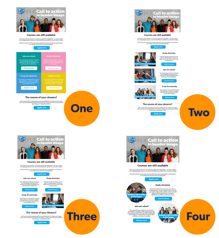
Email campaigns: layouts and images
We compared the performance for our four optimised templates and client HTML. The most popular choices by clients were Template 2 and HTML, but Template 2 performed the best for opens, unique clicks and CTO. Template 1 performed almost as well as Template 2 for CTO and open rate.
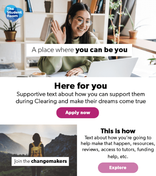
Use one of our templates, or apply the layouts to your own HTML designs:
- Attention-grabbing header (clickable)
- Short introduction section (a sentence or two)
- CTA button at the top
- Plenty of images throughout
- Logo in the header, but not at the bottom
Use our image tips:
- Image-heavy creatives preferred
- All images should be clickable (treat them like CTA buttons)
- Use an image to draw attention to each subsection
- In 2020 geometrics shapes, photographs and graphics were popular
- Images should be intriguing (especially headers)
Email campaigns: subject lines, copy and CTAs
Copy the format of our clients' best-performing subject lines:
We recommend doing a split test on your subject line to get the best results. Example: "Apply to study Psychology this September" and "Psychology places in Clearing"
- Short and impactful
- Mentions university by name
- Mentions the course
- Sense of urgency e.g date/deadline
Follow these messaging guidelines:
- Concise - don't waffle
- Supportive tone e.g. "here for you"
- Include honest reviews/comments from current students
- Signpost resources, courses and support services
- Everyday language - avoid long sentences/complicated grammar
- Avoid "trigger" words that will affect deliverability e.g. "free" or "guarantee"
- Avoid "triggering" words - think about how your language will land (students' mental health/different socio-economic backgrounds)
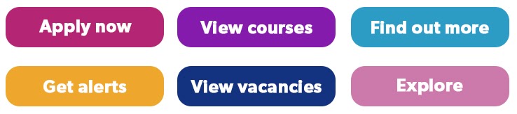
Plan CTAs around these key trends:
- Layout: Hard CTA in header and footer, soft CTAs in middle sections
- Best hard CTA: Apply now
- Best soft CTAs: View courses, View vacancies, Explore, Find out more, Get alerts
Most popular words/phrases in subject lines that had an open rate of +25%
Our Dos and Don'ts to maximise email campaign response rates
Do
Use everyday language
Keep your tone supportive
Get to the point - especially with subject lines
Make all images clickable
Don't
Don't make CTAs too long
Don't use trigger words (or if you must, put them in your images)
Don't use boring header images
Don't use convoluted or complicated sentences
Key takeaways
- Design for mobile first, then other devices like desktop
- Make sure your creative is fit-for-purpose (consider ad size, device it will display on, and if your audience will be able to read the copy)
- Remember that email and display should be treated differently (e.g. minimal imagery for display, but image-heavy for email)
- Focus on grabbing your audience's attention (find out what interests and excites them, seek student insights, split test creatives)
- Use simple, everyday language
- Don't re-run last year's creative because you risk Year 12 having seen it before (fatigue)
- Think about the emotional impact of your creative choices (e.g. colour, triggering words). Empathise - if you were about to invest £30,000+ during highly uncertain times, how would you want to be communicated with?