Optimise your Clearing creative
Insights from the best-performing 2020 campaigns
It takes a long time to work out your messaging and creative, so get a head start by learning what worked best on our vast student audience in 2020. Use this guide to maximise response rates to your Clearing 2021 campaigns.
Get in touch
Creative performance
Maximise your engagement and Clearing applications by incorporating our insight-led tips into your creative. We tracked the engagement rates for all our university clients' Clearing campaigns in 2020 and identified the key trends:
Display campaigns
Messaging
Heart-led and aspirational messaging resonated best with our student audience. The most effective campaigns used emotive and supportive words like:
- SUPPORT
- BE PART OF A COMMUNITY
- DREAM BIG
- FUTURE CERTAINTY
Compared with previous years, effective 2020 messages were longer and more conversational.


Use of images
Images with no people were most popular. In 2019 the opposite was true, this could be a result of anxiety about social distancing.
Campaigns that made heavy use of real-life imagery were less effective.
GIFs were the most successful. Many clients also used video style animations to great effect.
Use of colour
We analysed the top colours from Clearing 2020 and noticed a significant shift to more muted, cool-toned colours. Perhaps this reflects the emotions arising in lockdown. These were the best performing tones:
Blue tones - performed best
Blue is a conservative and traditional colour that works well when presenting facts or information. It also evokes feelings of calm, stability and loneliness which may explain it's popularity during the pandemic. Turquoise is a brighter, more cheerful shade of blue, while the deeper shades denote professionalism.
Associations: calm, trustworthiness, intelligence, responsibility, security, order, peace, tranquility, loneliness, sadness
Green tones
Green has a calming effect and is thought to relieve stress.
Associations: health and healing, growth, the natural world, money, luck
Pink and red tones
Both pink and red are highly visible colours, which makes them attention-grabbing. Pink is slightly softer and has more gentle associations. These are usually popular shades, but not in 2020.
Associations for pink: kindness, gentle or romantic love, thoughtful, caring, nurturing, compassion
Associations for red: desire, passion, hunger, love, action, danger
Yellow tones
Also a very attention-grabbing colour, but can be abrasive if overused. Here we can see a more muted yellow palate.
Associations: optimism, joy, take action, warning, sunshine, warmth, summer, bright, happiness
Email campaigns
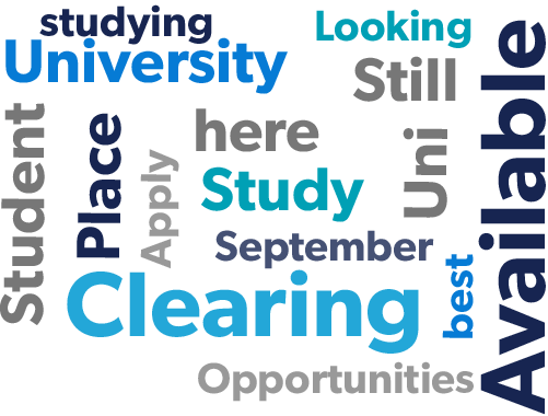
Top-performing subject lines in Clearing 2020
The wordcloud shows the most words and phrases that got the best open rates in Clearing 2020:
Messaging
The top-performing emails were very supportive in tone.
Call-to-action
The top performers were:
- Find out more (soft CTA)
- View vacancies (soft CTA)
- Explore (soft CTA)
- Apply now (hard CTA)
Overall, soft CTAs performed better.
Imagery
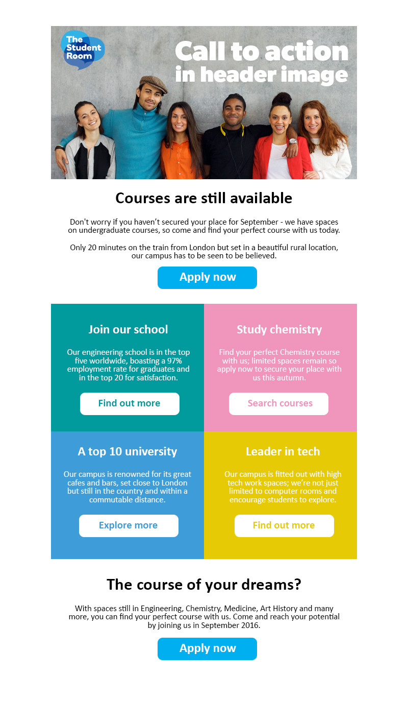
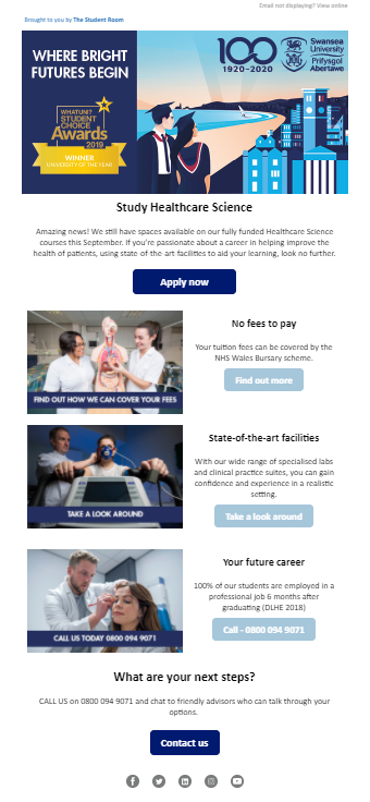
Images that had a very clear message or call-to-action incorporated performed well. The Student Room's audience used these images to click-through.
GIFs worked well in header imagery.
Look and feel
Always include a CTA in the top third of the email. We tested and optimised four template layout designs for client campaigns. Template 2 and Template 1 (pictured below) worked best in Clearing 2020: