How to stand out from the crowd in Clearing
Assets from webinar held on 22 February 2022
Back for a third year, we look at the key trends in successful Clearing creatives from the 2021 cycle.
Watch the webinar recording:
Stand out from the crowd in Clearing
Presenter: Hulda Fridriksdottir
Head of Client Services
Clearing 2021 on The Student Room
TSR Clearing activity in numbers:
1.2 M pageviews on Results Day
2.1M users across Results Week
+10K posts on Results Day
+2m average session duration
Clearing survey: What did 2021 applicants think of Clearing?
We asked students who received Clearing communications from us what would be more useful for them. They wanted more information about:
- Social proofing
- Preparing for uni (e.g.“survival guide”)
- University accommodation
- Student finance
- Mental health assistance (as Clearing is such a stressful time).
Display on The Student Room
+76m impressions
40,477 clicks
224,543 conversions tracked
Design for mobile first: The majority of users are on mobile.
Daily users
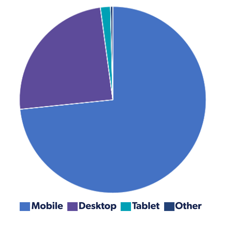
Don't miss your chance for conversion tracking! Cookies are going next year, but we can gather performance data for you this Clearing cycle to guide future campaigns.
Ad unit performance
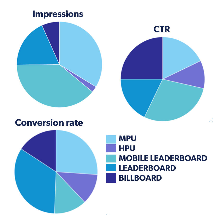
Choose the right ad size: look at all ad units, but start with mobile ones
- Best for impressions: Mobile Leaderboard (MLB) or Mid Page Unit (MPU) - same as in 2020
- Best for CTR%: MLB or Billboard (BB) - also the same as 2020
- Best for conversion: Leaderboard (LB)
Display layout
Either of these orders work:
Logo - message - CTA
Message - logo - CTA
Avoid real-life imagery, but do try this button style: All top performing creatives had the CTA in the bottom right corner and designed to look like their own button overlaid on the creative.


Colour in display advertising
Returning to trend: In 2020, we saw calmer colours (muted blues, lavender, murky yellow). In 2021, we saw the return of the most popular shades from the 2019 cycle (bright pinks and purples). Blue is consistently popular.
What do colours mean? Blues are associated with trust, information or facts and calm feelings. Pink is a colour associated with nurture and compassion. However, those in the 2021 palate are very bold shades, which might also suggest strength and perhaps even danger. Think about how Clearing applicants might be feeling - do these emotions ring true?
Copy, CTAs and what to avoid for display

Key themes for messaging:
- Mention the future e.g. "What does your future look like?"
- Empowerment e.g. "be..."
- Connect the course with their values e.g. "you can tackle climate change and end poverty"
The best performing campaign mentioned mental health support, so this is highly recommended.
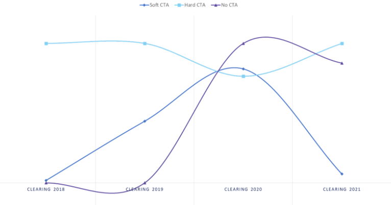
CTAs: Based on current trends we expect hard CTAs (like "Apply now") to be best for CTR in 2022. In 2020 during the pandemic soft CTAs (like "find out more" or "view courses") did well, but they did not perform well in the Clearing 2021 cycle. Having no CTA at all in display campaigns can also be effective for CTR.
Avoid:
- real-life imagery (e.g. photos of people)
- serif fonts
- language which is impersonal, uninspiring and fact-led e.g. "we have 50 courses available"
+1.3M emails sent
428,977 total email opens
14,511 total clicks on campaign links
32.5% highest recorded CTO
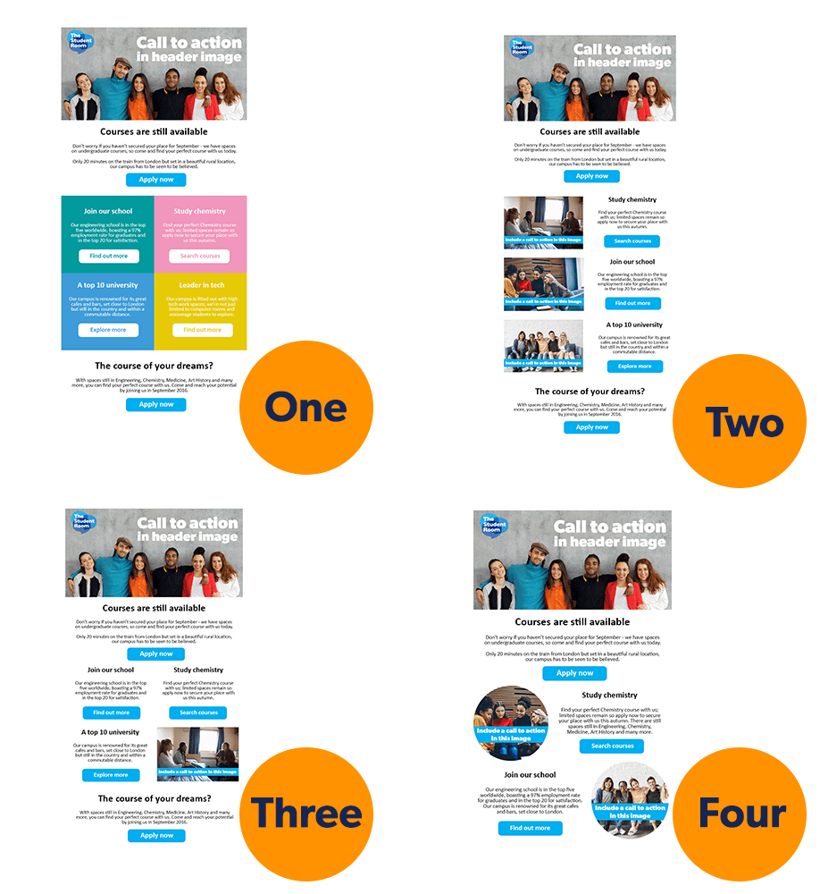
Email templates and layouts
IMPORTANT: due to the IOS update, click-to-send rates are now more reliable than click-to-open rates. Find out more.
We compared the performance for our four optimised templates and client HTML. Template 2 was the most popular choice with clients.
Template 2 was best for click-to-send rate, closely followed by template 1. Template 4 and client HTML were roughly equal, with Template 3 getting the lowest click-to-send rates.
Subject lines:
- Factual about the offering, not emotional - note this is a key difference from display
- Mention these: university name, course, time (e.g. "there's still time") and Clearing

Email copy and images
Messaging - what works well:
- Short, to-the-point
- Informative, step-by-step guidance
- Inclusive tone
- Courses laid out clearly
- Clearing FAQs
- Accommodation options
Imagery:
- Use photos of real people (facing camera works well)
- Overlay text on images and include a CTA in your header image
- Header image should be uncluttered
- All images should have a CTA and be clickable
- Use an image to draw attention to each subsection
- Use appropriate imagery that links with your subject matter
- Why not try gifs?
Email CTAs and what to avoid
CTAs - most effective was:
- A wrap-around of hard CTAs
- Most popular hard CTA was ‘Apply now’
- Most popular soft CTA was ‘View courses’
- Lots of ’find out more’ and ‘vacancies’ mentions in top soft CTAs

What to avoid:
- Images that do not contain people
- Large images that exceed mobile screen size
- Complicated or inaccessible language and grammar
- Using an unsupportive tone
- Soft CTAs in the header image
- Long copy in CTA buttons
SMS
We could fully track clicks for the first time in 2021. SMS campaigns delivered amazing results:
88,367 SMS delivered
3,855 clicks tracked
30.89% highest tracked CTR
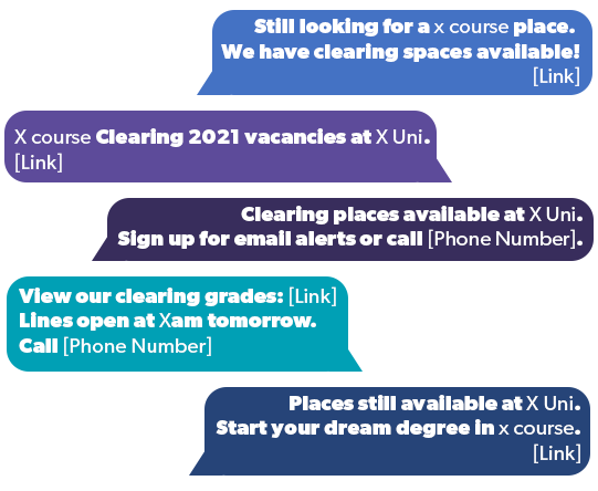
Messaging: The best campaigns used similiar copy to email subject lines - university name, course names, available places and Clearing.
Included a mix of CTAs (the most popular SMS contained either a hard CTA or no CTA).
SMS Messaging
Tips to stand out in Clearing 2022
Remember what these students have been through - no GCSEs, brand new exam and revision approach, confusion around advance information for exams, staff shortages, long-term disruption to their learning.
What can you do?
- Highlight support you have on offer (e.g. mental health, financial, careers)
- Address the issues young people are facing
- Remember the anxious person at the other end of your campaign


Show them why your university is right for them
Social proof - let them speak to their peers (current students) and see alumni career outcomes. This will give them an idea of what the university experience will feel like and where studying with you could take them.
Inspire them, but also be factual
- Use emotive language and connect with their values and dreams
- But also be aware of which communications are better for providing factual information (email, SMS)
- Make sure they are clear on key information (such as how and when to apply, course information, accommodation etc)
Key takeaways
- Design for mobile first
- Remember that display and email should be treated differently
- Use accessible language, fonts and colours
- Ask: "Do students understand our why?" "Does our USP resonate with them?"
- Use your ethos to steer campaign decisions
- Be genuine - students will spot insincerity
- If you were about to invest £30,000+ during highly uncertain times, how would you want to be communicated with?
